Commercial Confectionery is a photographic and editorial project that examines how context reshapes the perception
of value and cultural significance.
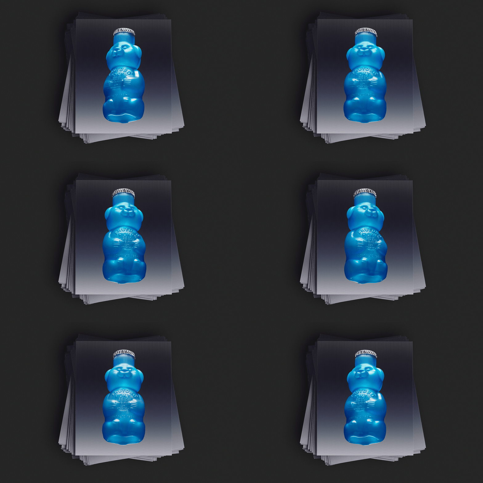
Its subject is Mexican mass-market candy — the kind found at every dulcería and street stand — photographed
with the visual reverence typically reserved for luxury objects. Precision instruments, clinical environments,
and careful composition bring a new seriousness to objects already rich with color, memory, and identity.
The tension between these two registers — the playful and the rigorous — forms the project's central visual argument.
On Visual Culture:
The Commercial
Confectionery Study
In an era where authenticity battles aspiration,
we find ourselves examining the curious rituals of cultural elevation. We wonder if theres a formula that
transforms the mundane into the magnificent? How does context reshape meaning? These questions drove our
recent exploration into the visual language of value perception.
The Mexican confectionery—with its riot of colors, textures, flavors and unapologetically bold
packaging—presents a fascinating case study in cultural expression. These confections, found in
every street corner and street stand across Mexico, carry within them layers of memory, identity,
and shared experience that extend far beyond their commercial function.
The Methodology
Our investigation began with a simple premise: apply the visual reverence typically reserved
for luxury objects to mass-market products that could serve as compelling case studies. We wanted
to ground this visual investigation in items from popular markets—well known for being
accessible to everyone.
The confectionery category emerged as an obvious choice, offering an extensive library of
typologies—diverse forms, textures, colors, and design approaches within a single product category.
Through careful curation (selecting for texture variation, transparency, scale, and chromatic diversity)
we curated a collection that highlighted the striking colors and
forms that make these candies naturally photogenic subjects.
We wanted to intensify the visual tension by incorporating precision instruments into our compositions.
Cold steel against vibrant polymers. Clinical environments hosting playful forms. This approach created a new
visual vocabulary—one that questions our preconceptions about worth, craft, and cultural significance.
On Process
The absurdity of our approach by photographing ordinary
candy with the seriousness typically
applied to Swiss watches or Italian leather goods,
became our central fascination. This deliberate
overtreatment revealed new possibilities within familiar
forms, demonstrating how perspective and presentation
can entirely reshape audience perception.
We fully embraced this contradiction, creating
a visual language that celebrates the inherent qualities
of these candies while questioning why certain
objects receive serious attention and others don't.
The process itself became as important as the final
images—a playful yet rigorous exploration of how
context transforms meaning.
THE EDITORIAL
The editorial object extends this logic into physical form. Drawing its aesthetic DNA from
the dulcería and papelería, the projectis delivered as a curated set: a custom envelope
containing a double-sided poster, an 18-page zine collecting the complete photo series alongside written
reflection, and a holographic postcard. The container speaks the same language as the contents.
specifications
about the authors
Adriana Mora and Cèlia Pladevall are a Mexico City–based creative duo who have developed a practice
that treats commercial image-making as cultural investigation. Their collaborative work explores the intersection
of design, identity, and perception through projects that challenge conventional hierarchies of value.
Daniel Martínez is a Mexico-based creative director and graphic designer whose work approaches visual
creation as a form of cultural investigation. Drawing from a wide vernacular of art and historical
visual culture reinterpreted through pop culture references, his practice spans branding, spatial curation,
and product experience, exploring how identity can be expressed through distinctive visual languages,
expressive typography, and a deliberate use of color.
STUDIO INQUIRIES:
[Photography and Art direction: hello@byelectra.com]
[Brand Identity and Editorial Design: daniel@dml.studio]
To buy, license, or simply talk about candy: hello@byelectra.com / @adrianamoram
© 2026 COMMERCIAL CONFECTIONERY. All rights reserved worldwide.